Helonia Neue: Meaning, Typeface Claims, and What to Know
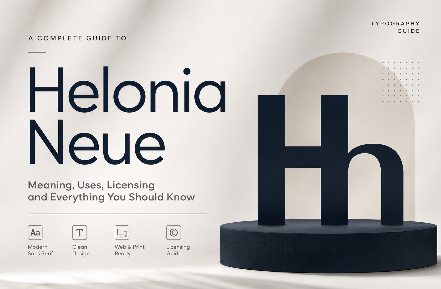
Helonia Neue is a search term that appears increasingly in discussions about typography, modern design, and contemporary branding. However, anyone searching for it should begin with an important question: is Helonia Neue a clearly documented, commercially available typeface, or is the name being used inconsistently across websites?
That distinction matters. Typography decisions affect readability, branding, licensing, website performance, and long-term design consistency. A font name that appears widely in search results is not automatically a verified font product with a traceable designer, foundry, licence, and official distribution channel.
This guide takes a careful, evidence-first look at the term, the claims surrounding it, and the practical lessons designers, business owners, and website creators can apply when choosing a modern typeface.
What Is Helonia Neue?
The available information around this name is inconsistent.
Several online articles describe it as a modern sans-serif typeface with clean lines, geometric proportions, and broad applications across web design, branding, and print. Yet these descriptions are not, by themselves, enough to establish a verifiable typeface history.
A particularly important finding is that searches for the exact name can lead to conflicting claims. Some sources present detailed stories about its origins and design characteristics without clearly identifying an established type foundry or an official product page. Other sources explicitly question whether the typeface exists as a distinct, professionally documented font family.
For this reason, the most responsible definition is:
Helonia Neue is a typography-related search term associated online with a modern, minimalist sans-serif style, but its status as a clearly verifiable, officially distributed typeface requires careful confirmation before use.
This is not merely a technical detail. It changes how designers should approach downloading, licensing, and recommending the font.
One verifiable source of confusion is the similarly named Hellonia, which is a different font family listed by MyFonts and published by RantauType. Hellonia is described as a retro serif display font, which is substantially different from the modern sans-serif descriptions often attached to the Helonia Neue search term.
Why Is There Confusion Around the Name?
Typography is full of similar names.
A single missing letter, an added word, or a spelling variation can lead users toward a completely different typeface. Search engines may also group similar queries together, especially when users repeatedly search for terms with spelling variations.
The confusion may involve names such as:
- Helonia Neue
- Hellonia
- Helvetica Neue
- Helliona
- Other similarly named display or sans-serif fonts
These are not automatically the same thing.
This creates a common online problem: a website publishes a detailed article about a font, other websites repeat the information, and eventually the repeated descriptions can make an unverified claim appear authoritative.
My first rule when evaluating a typeface is simple: follow the evidence back to the creator or distributor.
If you cannot identify the designer, foundry, official product page, or licence, you should not assume that every description found online is accurate.
The Meaning of “Neue” in Typography
The word Neue is German for “new.”
In typography and product naming, it is often used to suggest that something is a revised, updated, or modernized version of an earlier design.
However, the presence of the word does not prove that a formal predecessor exists.
For example, a genuine typeface family may have a documented earlier version and a later redesign with updated character sets, spacing, weights, or technical support. In that situation, the word can communicate a meaningful design evolution.
But when evaluating an uncertain font name, you should ask:
Is There an Original Typeface?
Look for a documented earlier family.
A reliable source should ideally identify:
- The original typeface name
- The designer
- The year of release
- The foundry or publisher
- The relationship between the original and the newer version
Without this information, claims about a redesign should be treated carefully.
Is the “New” Version Official?
A redesign can be official, unofficial, or simply a descriptive label used by a third party.
This matters because unofficial versions may have unclear licensing and technical quality.
Can the Typeface Be Verified?
The strongest evidence usually comes from:
- The type designer’s official website
- An established type foundry
- A reputable font marketplace
- Official documentation
- Clear licensing information
A polished article alone is not enough.
What People Usually Expect When Searching for This Typeface
Search intent around this topic appears to fall into several practical categories.
Most users are likely looking for one or more of the following answers:
- What is this font?
- Where can I download it?
- Is it free?
- Can I use it commercially?
- What does it look like?
- Is it suitable for websites and branding?
- What are the best alternatives?
A genuinely useful article should answer these questions without pretending that uncertain information is confirmed.
That is especially important for font-related searches because an incorrect download or licence decision can create problems for a commercial project.
The Design Characteristics Commonly Associated With the Term
Online descriptions commonly associate the name with a clean, contemporary sans-serif appearance.
The characteristics often mentioned include:
Clean Letterforms
Modern sans-serif typography is frequently chosen because it can create a direct and uncluttered visual impression.
Clean letterforms can work well for:
- Technology brands
- Portfolio websites
- Corporate communications
- Digital products
- Editorial layouts
- Architecture and interior design brands
However, visual claims about a specific font should always be checked against an actual specimen rather than copied from descriptive articles.
A font specimen is far more useful than a paragraph full of adjectives.
Balanced Proportions
Good typography depends heavily on proportion.
The width of letters, the height of lowercase characters, spacing between glyphs, and the relationship between strokes all influence how text feels and reads.
A font may look elegant in a large headline but perform poorly in a small paragraph.
That is why designers should test actual text rather than selecting a font based only on a promotional image.
A Modern and Minimal Appearance
Minimalism remains popular in digital design because it can help information feel organized.
But minimal does not automatically mean readable.
An extremely thin font may look sophisticated in a large hero section while becoming difficult to read on a mobile screen. Similarly, tight letter spacing may look dramatic in a logo but fail in body text.
The best modern typography balances visual personality with practical usability.
The Real Benefits of Choosing the Right Modern Typeface
Whether you ultimately use the font associated with this search term or choose a verified alternative, selecting typography carefully offers several benefits.
Better Brand Recognition
Typography becomes part of a brand’s visual voice.
A playful typeface can make a company feel informal. A refined serif may communicate tradition. A neutral sans-serif may suggest clarity and efficiency.
The important point is consistency.
Using one carefully selected type system across your website, social graphics, presentations, and printed materials can make the brand feel more coherent.
Improved Readability
Typography affects how easily people consume information.
Important factors include:
- Font size
- Line height
- Letter spacing
- Contrast
- Screen resolution
- Text length
- Background color
A visually attractive font cannot compensate for poor reading conditions.
Greater Design Consistency
A well-planned font system reduces random decisions.
Instead of choosing a different style for every page, a designer can establish a structure such as:
- Display style for major headings
- Strong weight for subheadings
- Regular weight for body text
- One consistent style for buttons and navigation
This creates a predictable visual hierarchy.
Better User Experience
Typography helps users understand what matters first.
A clear hierarchy can guide readers through:
- The page title
- The main message
- Supporting information
- Important actions
When everything has the same visual weight, users must work harder to understand the page.
The Biggest Challenge: Verifying the Typeface Before Using It
The main challenge surrounding this search term is not choosing a bold or regular weight.
It is verification.
Before downloading any font presented under this name, check the following.
Find the Original Source
Ask where the file comes from.
Avoid treating random file-sharing websites as authoritative sources.
A trustworthy source should make it possible to identify who owns or distributes the font.
Check the Licence
This is essential.
A font can be:
- Free for personal use only
- Free for commercial use
- Licensed for desktop installation
- Licensed separately for websites
- Licensed for mobile apps
- Licensed for digital advertising
- Licensed by the number of users or page views
These permissions can differ significantly.
Never assume that downloading a font means you own unrestricted rights to use it.
Confirm the File Is Genuine
A file with a familiar name may not be an official release.
Before installing it, consider:
- Is the source reputable?
- Is the file accompanied by licence information?
- Does the distributor identify the creator?
- Is the file digitally associated with a legitimate publisher?
This is a practical step that many rushed design workflows overlook.
Helonia Neue and Website Design
If you are evaluating a modern font for a website, appearance is only one part of the decision.
Test It at Small Sizes
Many typefaces are designed to make a strong first impression in large text.
Website body copy is a different challenge.
Test the font in:
- 14px
- 16px
- 18px
- Mobile widths
- Long paragraphs
- Navigation menus
Do not judge readability only from a 100-pixel headline.
Test Different Weights
A complete font system may include multiple weights.
But adding many font files can affect website performance.
A practical website often needs only a limited number of styles.
For example:
- Regular for body text
- Medium or semibold for navigation
- Bold for headings
The exact combination depends on the project.
Check Mobile Rendering
Typography can change dramatically on a small screen.
A headline that looks balanced on a desktop may wrap awkwardly on a phone.
Before publishing:
- Open the page on a real mobile device.
- Read several paragraphs.
- Check line breaks.
- Check buttons and menus.
- Test readability in different lighting conditions.
Real-world testing is more valuable than assuming a desktop mockup represents every user.
Branding Applications
Modern sans-serif typography can be highly effective in branding when it matches the personality of the organization.
Possible applications include:
Technology Brands
Clean typography can support a message of efficiency, clarity, and innovation.
Professional Services
Consulting firms, agencies, and financial businesses often prefer controlled and readable type systems.
The goal is usually credibility rather than visual decoration.
Fashion and Lifestyle Brands
A refined sans-serif can provide a minimal foundation while photography and color add personality.
Editorial Projects
Modern typography can help organize articles, reports, and digital magazines.
But body text still needs careful testing because editorial reading involves longer passages.
Print Applications
A typeface that works on a screen is not automatically ideal for print.
Print projects introduce different considerations.
Small Text
Very light weights may lose clarity when printed at small sizes.
Paper Quality
Uncoated and textured paper can affect how fine details appear.
Ink and Production
Letterforms may reproduce differently depending on the printing process.
For important printed materials, request a physical proof when possible.
This is one of the most practical lessons I have observed in design workflows: a font can look perfect in software and noticeably different when it becomes a physical object.
How to Evaluate Any Typeface Properly
Instead of asking only, “Does this font look good?”, use a structured evaluation process.
Step 1: Define the Project
Start with the purpose.
Is the font for:
- A logo?
- A website?
- An app?
- A book?
- Social media?
- Packaging?
- Signage?
Different uses require different strengths.
A decorative display face may be excellent for a logo but unsuitable for a long article.
Step 2: Check Readability
Use real content.
Do not test only the phrase “The quick brown fox jumps over the lazy dog.”
Instead, paste:
- A real paragraph
- A product description
- A navigation menu
- A long headline
- Numbers and dates
This reveals practical weaknesses.
Step 3: Check Character Coverage
Does the font support the languages your audience uses?
Also test:
- Currency symbols
- Mathematical symbols
- Punctuation
- Accented characters
- Numerals
A beautiful font with missing characters can create serious problems later.
Step 4: Check the Licence
Read the licence before building the entire project around the font.
Changing a font after completing a website or brand identity can be expensive.
Step 5: Test Performance
For web use, consider:
- File size
- Number of font files
- Loading behavior
- Fallback fonts
Typography should support user experience, not slow it down unnecessarily.
Step 6: Test Accessibility
Good typography should work for more than one type of reader.
Avoid relying on:
- Extremely small text
- Very thin weights
- Poor contrast
- Excessive letter compression
- Long lines without comfortable spacing
Accessibility is not a decorative afterthought. It is part of functional design.
How to Download Fonts Safely
If you are specifically trying to find this typeface, do not download the first file that appears in search results.
Use this process.
Check for an Official Foundry
Search for the designer or foundry connected to the font.
Verify the Product Page
Look for a page containing:
- Font specimens
- Designer information
- Licence details
- Available formats
- Purchase or download terms
Avoid Suspicious Downloads
Be cautious when a website offers a supposedly premium font with no information about the rights holder.
Free does not always mean legitimate.
Keep Your Licence Records
For commercial projects, save:
- Purchase receipts
- Licence documents
- Version information
- Download confirmation
This makes future compliance easier.
Should You Use a Free Alternative?
Sometimes the best decision is not to spend more time searching for an uncertain font.
A verified alternative may be the safer choice.
When choosing an alternative, compare more than appearance.
Look at:
- Licence
- Readability
- Weight range
- Character support
- Web performance
- Long-term availability
Popular open-source font families can be practical because their documentation and licensing are easier to verify.
However, each project should still be evaluated individually.
The best alternative is not necessarily the one that looks most similar in a screenshot. It is the one that meets the actual technical and design needs of your project.
Common Mistakes to Avoid
Mistake 1: Trusting Repeated Information
The same unverified claim can appear on multiple websites.
Repetition is not proof.
Mistake 2: Downloading Before Checking the Licence
This can create problems after the font is already integrated into a commercial project.
Mistake 3: Using a Display Font for Long Text
Large headlines and long paragraphs have different typographic needs.
Mistake 4: Choosing a Font Only Because It Is Trending
A trend can disappear quickly.
Brand typography should ideally remain useful beyond a short visual fashion cycle.
Mistake 5: Using Too Many Fonts
More fonts do not automatically create more personality.
In many projects, a limited and well-structured type system works better.
Mistake 6: Ignoring Real Device Testing
A font should be tested where people will actually use it.
That may include phones, laptops, tablets, printed documents, or large signs.
A Practical Typography Workflow for Beginners
If you are not a professional typographer, you can still make better decisions by following a simple workflow.
Define Three Words for Your Brand
For example:
- Modern
- Trustworthy
- Friendly
These words help narrow the design direction.
Select a Small Group of Candidates
Choose three to five verified font families.
Avoid downloading dozens without a clear purpose.
Create a Test Page
Use the same content in every font.
Include:
- A main heading
- A subheading
- A paragraph
- A button
- Numbers
- A list
Compare Them at Real Sizes
Do not enlarge everything just to make the typeface look impressive.
Test With Real Users
Ask someone to read the content.
If they struggle, the problem may be more important than your personal aesthetic preference.
Document the Final Choice
Record:
- Font family
- Weights used
- Font sizes
- Line heights
- Licence details
This creates consistency for future work.
The Difference Between Typography Style and a Verified Font Product
This distinction is central to understanding the search.
A typography style is a visual category.
Examples include:
- Geometric sans-serif
- Humanist sans-serif
- Transitional serif
- Slab serif
- Display script
A font product is a specific, identifiable creation.
It should have a traceable identity.
For example:
- Name
- Designer
- Publisher or foundry
- Version
- Licence
- Distribution channel
A website can describe a style accurately while still making unsupported claims about a specific font product.
That is why users should separate visual inspiration from factual verification.
Is Helonia Neue Suitable for Commercial Work?
The responsible answer is: do not assume so until you can verify the exact font file and its licence.
Commercial use may include:
- Business websites
- Advertising
- Product packaging
- Client projects
- Mobile applications
- Paid digital products
The permission required can vary depending on the distribution method.
If you cannot find reliable licence information for the exact file, choose a font with clearly documented commercial terms instead.
This approach may feel cautious, but it protects both designers and businesses.
How Businesses Can Build a Stronger Font Strategy
Typography should not be selected as an isolated decoration.
A strong strategy considers the entire communication system.
Establish a Primary Typeface
Use it for the majority of brand communication.
Define a Hierarchy
Specify which weights appear in:
- H1 headings
- H2 headings
- H3 headings
- Body text
- Captions
- Buttons
Set Spacing Rules
Typography needs space.
Document:
- Line height
- Paragraph spacing
- Heading margins
- Maximum line width
Create Fallbacks
Digital systems do not always load fonts instantly.
A suitable fallback can maintain readability during loading.
Review the System Regularly
As websites and brands grow, typography can become inconsistent.
A periodic review can identify unnecessary styles and improve coherence.
The Future of Modern Typeface Searches
The growing number of font-related pages online creates a new challenge.
Users can now find hundreds of articles describing the same visual concept within seconds. But easy publication also means unsupported information can spread rapidly.
This makes source verification more important.
The future of useful typography content should focus less on repeating phrases such as “elegant,” “timeless,” and “versatile.”
Instead, it should answer practical questions:
- Who designed the font?
- Where is it officially available?
- What licence applies?
- What languages does it support?
- How does it perform at small sizes?
- Is it suitable for web use?
- What are the verified alternatives?
Those answers help people make decisions.
Frequently Asked Questions
What is Helonia Neue?
Helonia Neue is a typography-related term commonly associated online with a modern sans-serif style. However, the exact typeface’s official origin and distribution should be independently verified before use.
Is Helonia Neue a free font?
Do not assume it is free. Check the licence attached to the exact font file and verify the official distributor before downloading or using it commercially.
Where can I download it safely?
Use an official designer, type foundry, or reputable distributor with clear licence information. Avoid downloading unidentified font files from suspicious websites.
Is it the same as Hellonia?
No clear evidence supports treating them as the same font. Hellonia is a separately documented retro serif family published by RantauType through MyFonts.
Is it good for website design?
A modern sans-serif style can work well for websites, but the exact font should be tested for readability, mobile rendering, performance, and licensing.
What should I do if I cannot verify the font?
Choose a clearly documented alternative with a known designer, licence, and trusted distribution source.
Conclusion
The most important lesson is not whether a font name sounds modern or appears frequently in search results. It is whether the typeface can be verified and used confidently.
The descriptions surrounding this term often point toward qualities many designers want: clean forms, modern character, versatility, and strong digital appeal. But responsible design requires more than attractive descriptions. It requires checking the source, testing real text, confirming the licence, and evaluating performance in the environment where the typography will actually be used.
A well-chosen typeface can strengthen readability and brand consistency for years. A poorly verified one can create unnecessary legal and technical problems.
For designers and business owners, the best approach is evidence first, aesthetics second, and real-world testing throughout the process.